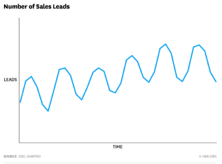
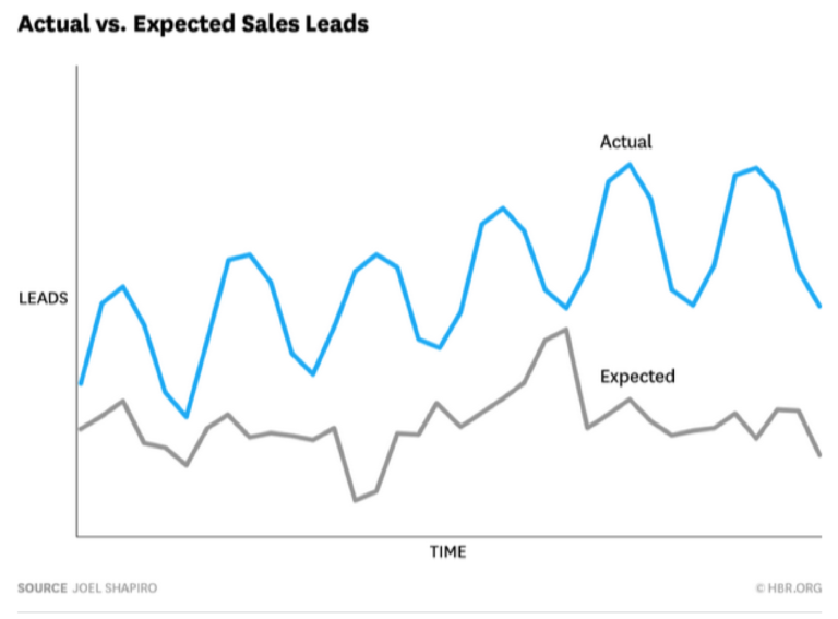
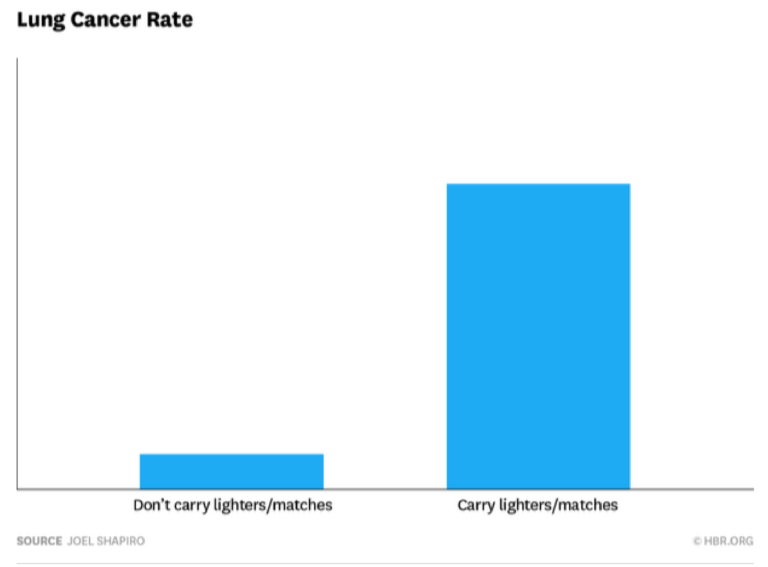
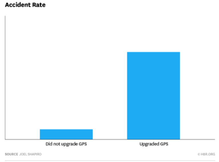
Executives love dashboards, and why wouldn’t they? Single-screen “snapshots” of operational processes, marketing metrics, and key performance indicators (KPIs) can be visually elegant and intuitive. They show just-in-time views of what’s working and what isn’t — no need to wait for weekly or monthly reports from a centralized data center. A quick scan of a dashboard gives frontline managers transparency and, ideally, the opportunity to make rapid adjustments.
But dashboards aren’t the magic view some managers treat them as. Although they can convey snapshots of important measures, dashboards are poor at providing the nuance and context that effective data-driven decision making demands.
Data analytics typically does a few things:
- describes existing or past phenomena
- predicts future events based on past data
- prescribes a course of action
Most dashboards, though, only cover the first — describing what has happened. Moving from description to prediction to action requires knowledge of how the underlying data was generated, a deep understanding of the business context, and exceptional critical thinking skills on the part of the user to understand what the data does (and doesn’t) mean. Dashboards don’t provide any of this. Worse, the allure of the dashboard, that feeling that all the answers are there in real time, can be harmful. The simplicity and elegance can tempt managers to forget about the all-important nuances of data-driven decision making.
To get better at creating and using dashboards, think about these three drawbacks to data dashboards.


